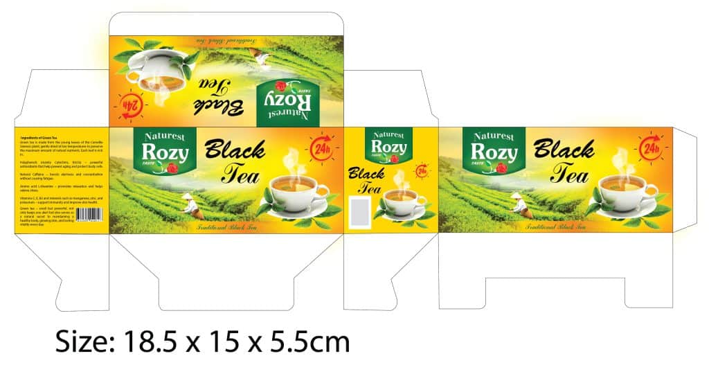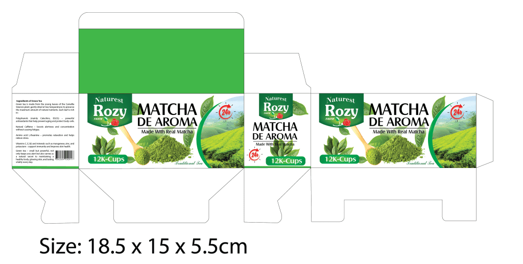
In Vietnam’s growing tea market, Naturest Rozy stands for purity, balance, and authenticity. The redesign of the black tea and matcha packaging line was guided by a single idea: to make everyday tea feel refined without losing its natural charm.
Dao created two distinct yet harmonious boxes — one for Black Tea, warm and grounded; the other for Matcha, fresh and vibrant. Each design carries its own personality while remaining part of one cohesive visual system. Dao’s concept embraces clarity: bold typography, bright natural imagery, and a structure that highlights both craft and freshness.
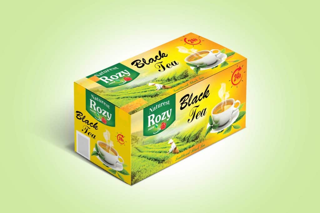
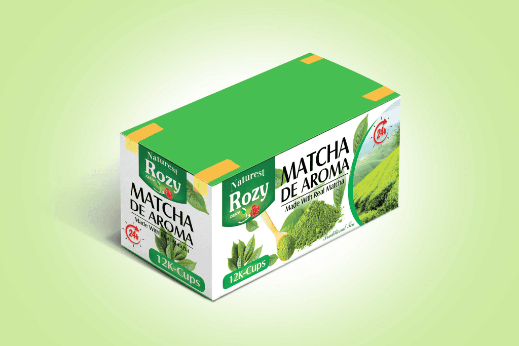
Every detail was considered — the texture of the paper, the matte finish, the interplay of color and light — turning each box into a tactile experience that reflects the character of the tea itself: earthy, aromatic, and uplifting.