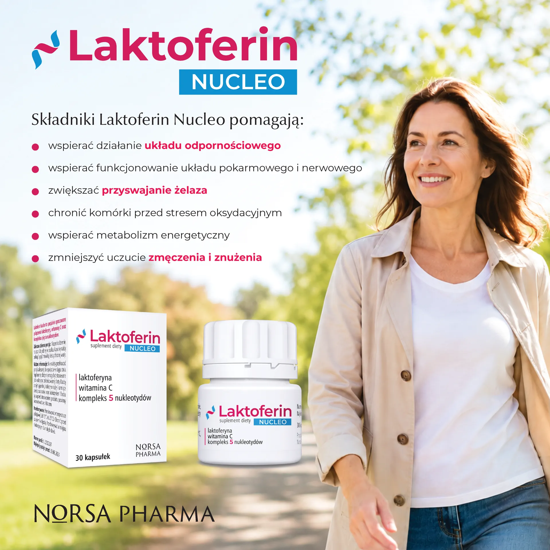
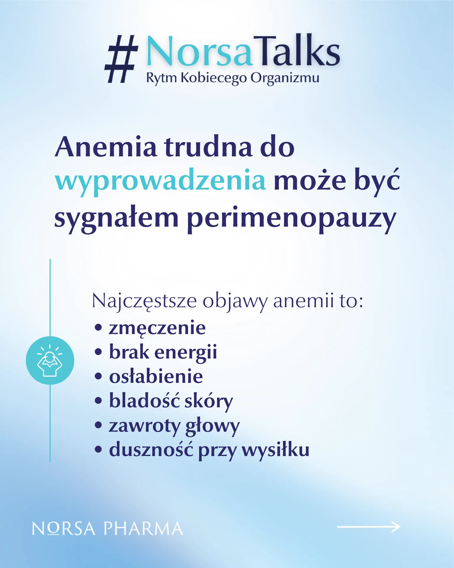
Norsa Pharma, a professional pharmaceutical company based in Kraków, was one of our first serious client engagements in Poland.
This was not a commissioned or paid project. The visuals shown here were created as an initial concept study to demonstrate how we approach a new client: how we read a brand book, understand the market context, and translate both into practical social media communication.
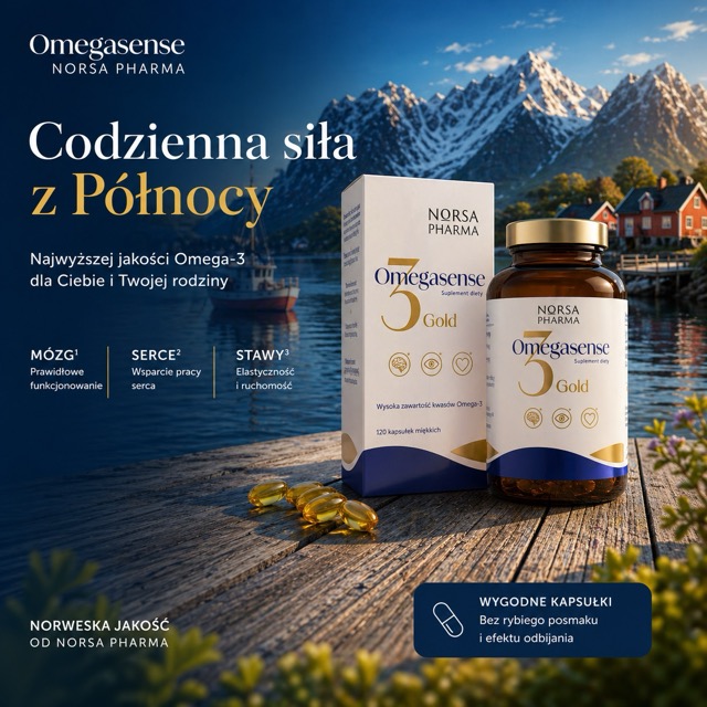
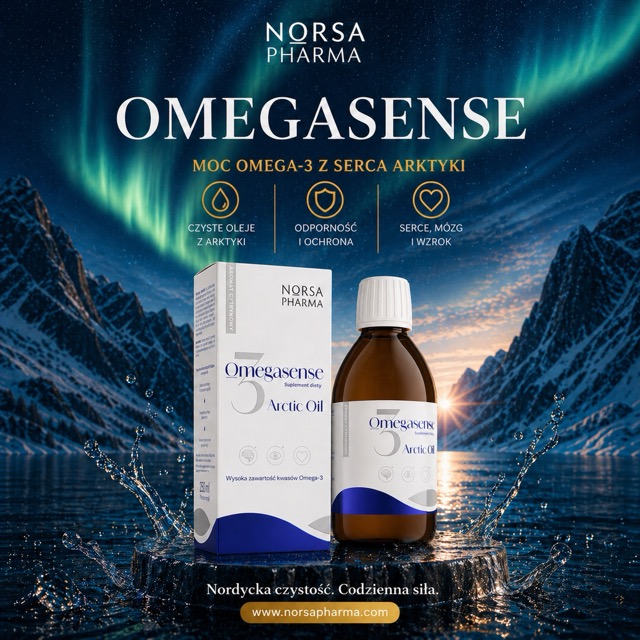
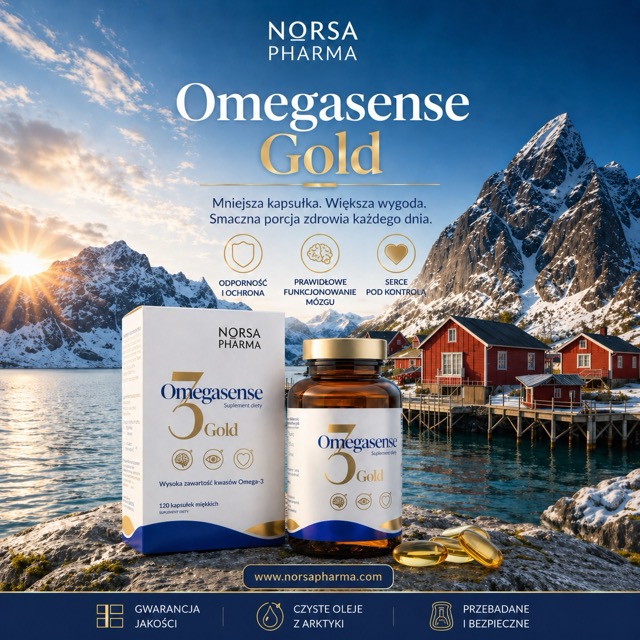
The client provided a high-quality brand book. Our task was to turn those guidelines into several Facebook campaign visuals within a short time frame. We intentionally worked in quick iterations, because early cooperation is mainly about calibration: checking whether we understand the brand, the visual direction, and the message.
For pharmaceutical communication, we also considered three common approaches: clear informational design, simplified visual explanation, and human-centered storytelling. For the first iteration, we chose the safest direction: clean, structured, brand-consistent visuals aligned with Norsa Pharma’s Nordic identity.
The main challenge in pharma is that the product rarely tells the story by itself. A package, bottle, or capsule needs a visual convention around it — one that explains, reassures, and builds trust.
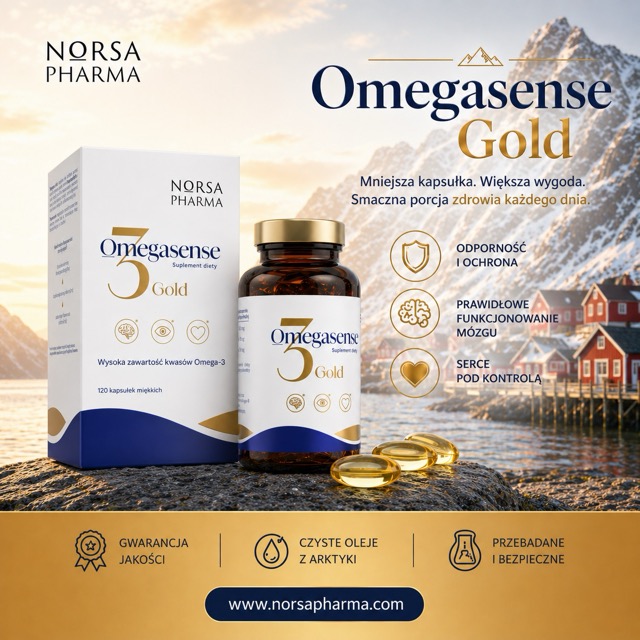
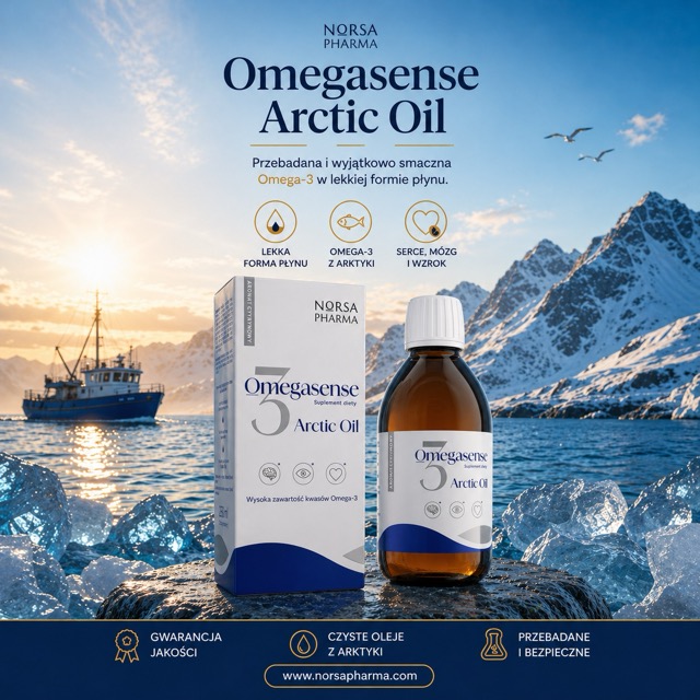
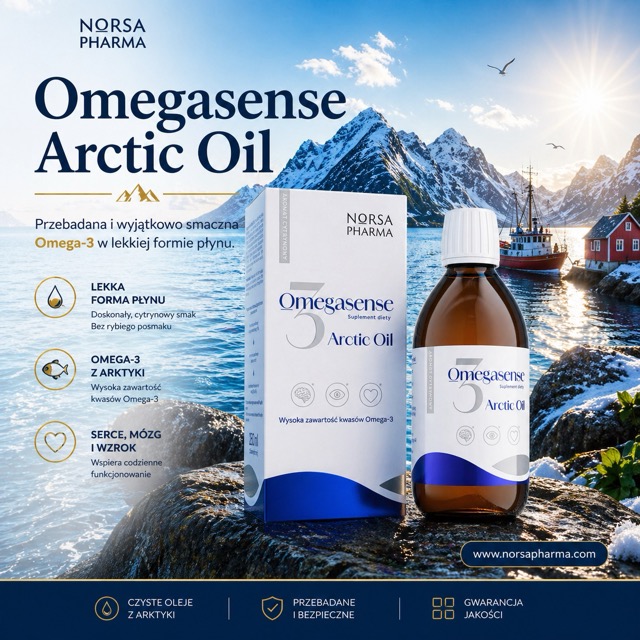
This case shows our preferred way of working: start with a strong direction, test quickly, learn from the client’s feedback, and improve through iteration.